Landing pages are a vital part of any inbound marketing strategy. They allow us to turn unknown website visitors into known contacts or leads. They are the gateway to all that content we spent so long on, and worked so hard creating .
Landing page creation doesn’t need to be a complicated affair but there are certain things you can do to make a landing page more appealing to the visitor and increase the chance they will actually convert.
A well crafted landing page is probably something we take for granted as the viewer – I know that before I worked in marketing, if I clicked on a Facebook ad, for example, and was whisked off to a landing page, I didn’t sit there and think to myself ‘hmm what a strategically written piece of copy with a strong, action focused call-to-action’ before filling out a form.
But, it’s the little things that make a big impact. And knowing what to include on your landing page can make the difference between your content offer flying or flopping.
What Is A Landing Page?
I was first introduced to landing pages in my previous role at a marketing agency. I remember people kept talking about creating landing pages, forms, content offers – I didn’t really get it. What is a landing page and how is it different from any other website page?
That was several years ago and I soon learnt by creating them on many different platforms. But whatever software you use, the principles of creating a well crafted landing page remain the same.
A landing page is a website page, but it is a website page with a specific purpose. In this blog I’m talking about content offer landing pages used to convert visitors to leads, a page purely focused on promoting an offer to the visitor. This could be an eBook, tip sheet, webinar, product demo – really any content that is valuable to the visitor. And value is the key, you can not expect people to pass over their personal information without providing them with something in return.

Why Use A Landing Page?
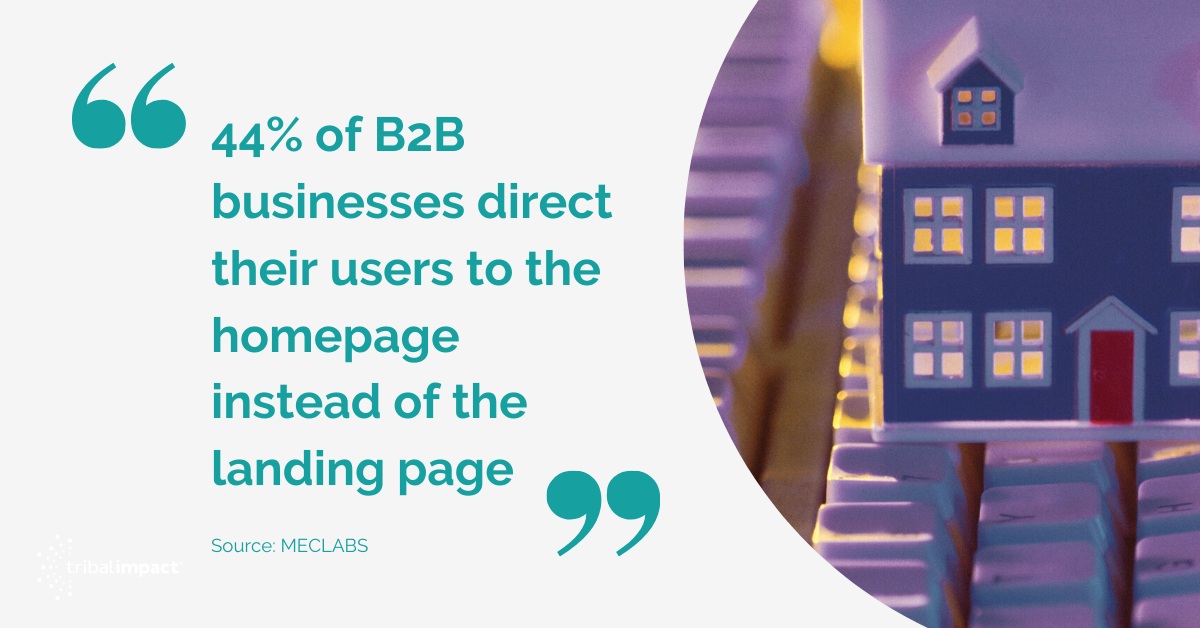
But hang on, instead of spending time and effort on creating a whole new page for one content offer, why can’t you just add a form to an existing website page, like your homepage, for example?
Well, you can do that, and in fact 44% of B2B businesses direct their users to the homepage instead of the landing page (Source: MECLABS). But this is a big mistake.
Think about it, if you're on the homepage of a company you've just found, or you’re browsing their ‘About Us’ page, scrolling down reading snippets here and there, trying to get a flavour for who the company are or what they do, and boom; you scroll on to a form with a title saying something about an eBook, it’s asking for you name, email address, job title… blah blah, what’s the likelihood you’ll scroll right on past? Or just leave the site altogether because that’s just not a great user experience.
Landing pages allow you to provide the visitor with enough information about what your content will provide them, in a clear and concise way without distractions. It’s landing page best practice to remove navigation, links to other pages and basically take away any other options so that the reader is focused purely on one thing; your brilliant content.
And the best part is that the visitors to that page will have had to take an action to land there by clicking through on a call-to-action, so something you're offering must have peaked their interest, now you just need to convince them to convert.
Elements To Include On Your Landing Page
So without further a-do, here are the elements that make a great landing page, primed and ready for creating inbound conversions:
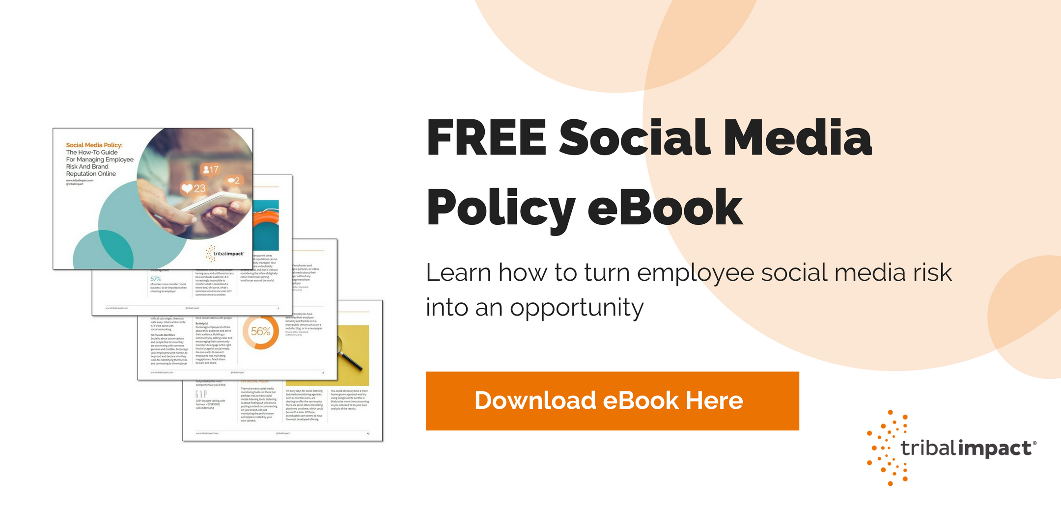
A Clear Headline
The headline of your landing page is the first thing people will see, and it could be the thing that stops them from bouncing straight off, so this is worth some thought! It’s also prime real estate for your chosen keyword, so make sure you include it here to improve SEO – of course we should all know by now, not to keyword stuff any headlines so make sure the headline flows naturally to the reader.
The headline should be punchy and clearly demonstrate the value of your offer – focus it around the problem you are solving for the reader, rather than how great you think your offer/product is. You only have 8 seconds to make an impression on a landing page. (Source: Interactive Marketing Inc)
Compelling Copy
Okay so this might seem like an obvious one, but words matter when it comes to convincing people to download your offer. Whether your content is a product sheet or a whitepaper – the copy on your landing page should tell the reader, in brief, what they will learn or gain from downloading the content. And of course, include your keyword here, too – it should be easy to do this as you should want your page to rank for a keyword relating to your content offer meaning it will occur naturally in the copy. If possible, try to include in the opening paragraph but again, only if it fits.
Don’t make the focus of the copy your product or business. People download content if it contains something they want to learn. If your content offer is an awareness piece, don’t try and sell your solution to people. If you know your ideal customers, you should know their pain points and you should be able to talk about how your content answers or solves some of their issues.
The copy should be snappy - why not include a list of bullets covering what the reader will learn? Or the top takeaways? You need to quickly convince so make its buyer focused and to the point.
It’s fair to say that the length of copy will depend on the complexity of the offer – provide enough detail to express the value of your content. For example, a one page tip sheet probably only needs a brief overview where as a report, case study, whitepaper… will need more depth – this also correlates to what stage of the buyer journey the content is aimed at.
Someone at the Decision stage, for example, who has already engaged with your brand, visited product pages, downloaded content, is more likely to spend time reading copy over someone in the awareness stage, who found your landing page via a quick Google search.
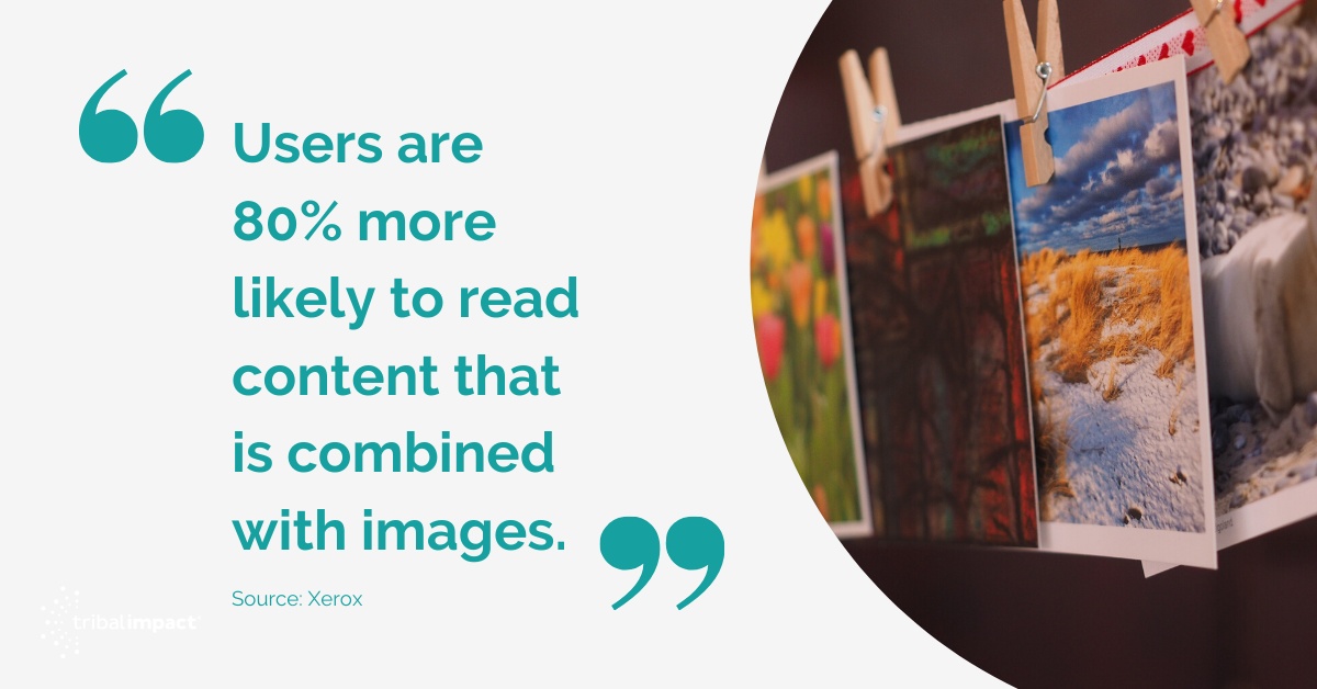
Eye-Catching Image
You may not think an image will make much difference, but it does. Users are 80% more likely to read content that is combined with images. (Source: Xerox)
We are visual creatures, whether you consciously notice it or not. Adding an image is more likely to result in a conversion. Whether it's an image of the downloadable offer, or a vivid image relating to the subject of your content, don’t overlook this design feature.
Once your landing page is up and running, you can A/B test your imagery to see what works best/ leads to higher conversion (also known as Conversion Rate Optimisation). It may seem like a small thing but the psychology of images in marketing is a well documented subject.
A Form Above The Fold
The form is an important part of any landing page, it’s where readers submit their details and subsequently receive their offer in some shape or form. If possible, place your form above the fold of your landing page, the more scrolling people have to do, the less likely they will be to stick around and fill it out.
The form must be easily accessible and primed for conversion. Something else to note about forms, is that you should never ask for too much information. This may be your opportunity to capture data on your website visitors, and you may want to know straight away if they are an ideal fit customer for your company, but the amount of information you can ask for relates to how valuable your content is.
At the very minimum you’ll want to capture the visitors email address. This is fine for a blog or newsletter subscription; you don’t need any other information to be able to deliver what your offering. When you start creating downloadable assets – eBooks, tip sheets, guides etc. you can ask for a little more info as what you're offering is more valuable.
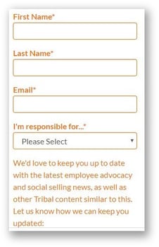
However, still only ask for what you need, you want to make the barrier to entry as low as possible. Don’t go asking for company revenue and number of employees, in exchange for an awareness piece of content, or from someone who has only just discovered your brand.
Form fields are a subject all of their own – if you have the technology, you can make sure a returning visitors details are already filled in so they don’t need to re-enter their details before submitting, you can use progressive profiling so that instead of asking a known visitor for the same information again, you line up subsequent questions to gain further insight and they are only required to fill out one field to download the content, because you have the other information already.
Knowing where your buyer is in their journey through the use of marketing automation helps here, but at a minimum be realistic about the value of your content – people are more likely to come back to you if you don’t ask for too much, too soon.
An Action Orientated CTA
This applies to the call-to-action that led the visitor to the landing page but also the CTA they need to click to download the content. It must be bold, stand out, with action orientated wording telling the reader what you want them to do e.g., Download, Register, Click, Subscribe…
If your using an image CTA rather than a button, you can add a little more sub-copy but make it concise and highlight benefits for the visitor.
This element should encourage conversion so needs to be bright and eye catching. Some hyperlinked text, for example, will not do. CTA’s are also something that can be A/B tested once your page is up and running and receiving conversions. Changing the wording, colour, size can all make a difference. So keep in mind the basics as mentioned above, but know that you can test and change later on down the line.
Thank You Page
This isn’t something that will be on your landing page, it should follow it. Once your visitor has filled out your form and clicked on your bold call-to-action, then what? How do they get what is promised to them?
The best thing to do here is direct them to an aptly named ‘Thank You’ page. The basic purpose of this is to deliver them the offer they have requested, this can either be delivered via email, or available to download right there on the thank you page - the latter is my preference.
If I've downloaded a piece of content, I like to be able to look at it straight away, email delivery is useful to come back to later, however these kind of emails can easily get caught in spam filters and never delivered - here at Tribal, we do both, we also provide a personalised thank you message based on the content offer:
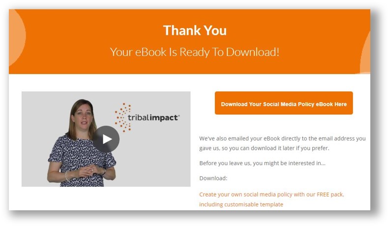
You can also use your thank you page as an opportunity to direct readers to other, similar content they may find useful, for example related blogs or content offers - this can be an opportunity to further engage visitors and also reduce the bounce rate of your website by keeping them on your site for longer.
So there you have it, the basics of how to create a landing page that will convert. When building these pages there are also some other best practices that should be taken into account, including making sure your page is responsive, optimised for search and that navigation is removed - but I will cover these in another blog!