.png?width=200&height=92&name=Tribal%20Logo%20Dark%20Grey%20(1).png)
There is a belief in our industry that influence can't be measured. In my experience it can, once you centre influence around a commercial objective. The genuine difficulty is time: influence has to be measured over months, and most B2B marketing programmes run on quarters. Budget cycles and campaign cycles are simply not built for a metric that moves slowly and compounds, which is why so many programmes end up tracking what moves quickly instead: engagement, reach, shares, adoption.
All of those are leading indicators. Our research across 860 B2B companies, The Human Edge, found the one that most advocacy dashboards miss.
The signal moves before your dashboard does
In more than 80% of the companies we tracked, VP and Director activity levels on LinkedIn this month is a positive leading indicator of employee activity the following month. When the middle layer of leadership slows, employee activity slows within a couple of months. When executives slow, the effect reaches employees too, though more gradually, because employees sit further from the C-suite than they do from the their own directors.
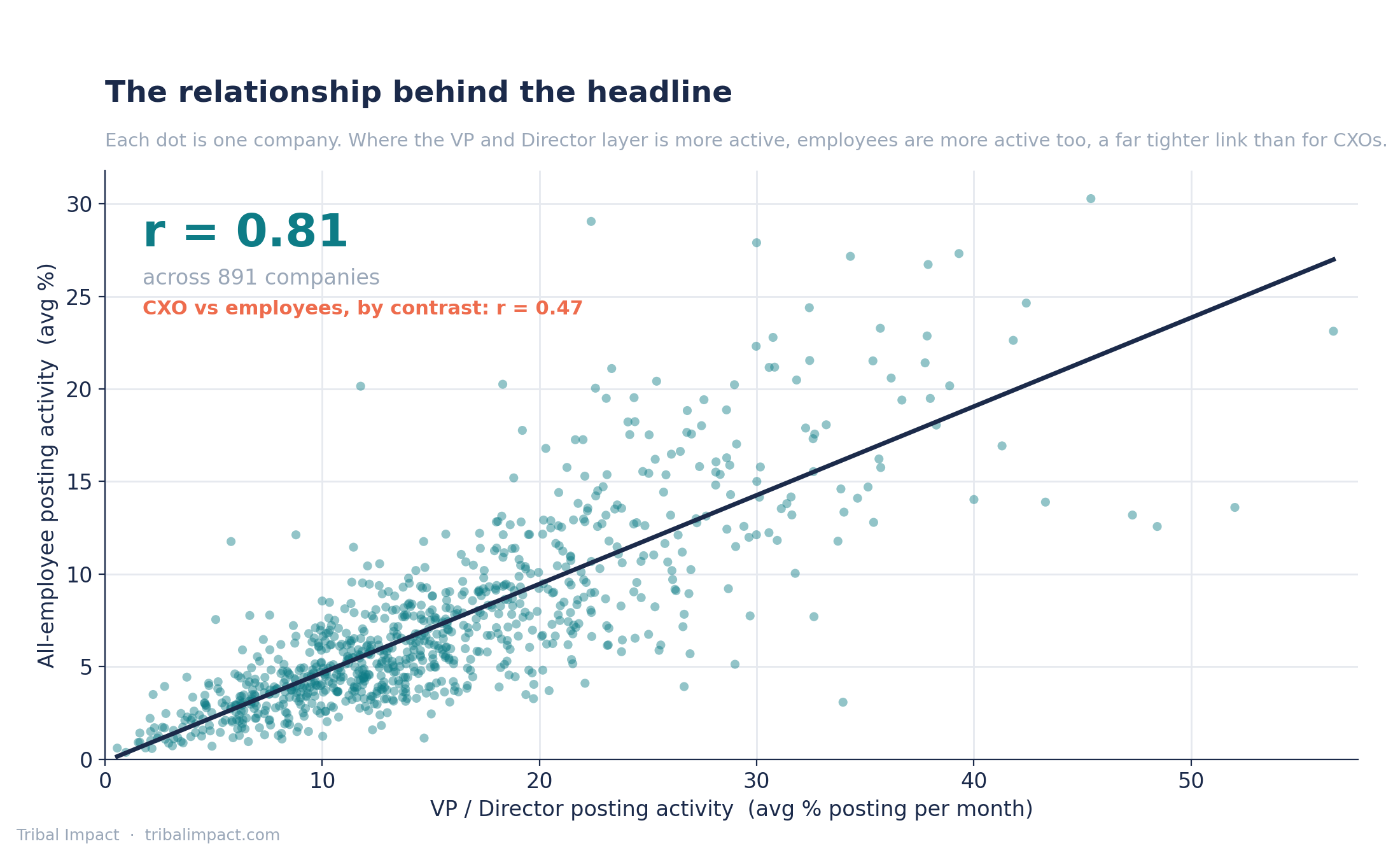
The practical consequence for a programme lead: by the time a decline shows in your advocacy platform dashboard, it has been underway for one to two months, and it started in a layer your dashboard probably is not watching. A monthly view is essential here. Quarterly reviews find the problem after it has already travelled down.
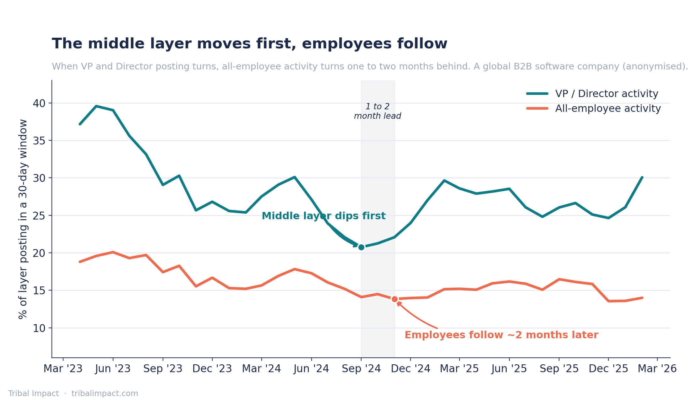
The earliest warning is not on LinkedIn at all
Here is something the data cannot show you but eleven years of client work can. The first sign of a leadership activity dip is not found on a chart. It's shown in the diary.
You should be meeting your executives regularly to curate their content strategy with them. The moment they start bumping those calls, cannot make them, or are too busy, that is your early warning, and it arrives weeks before anything changes on LinkedIn. That is the moment to remind them what their consistency carries: the knock-on effect on employee behaviour, and on whether customers see the organisation’s people at all.
In our client work, the rhythm that holds is a content strategy session with each executive every other month, with content built and scheduled from it, and VPs and Directors showing up consistently with three to five posts a month, with someone making sure it happens.
What the monthly early-warning view should contain
Track your executives and VPs by name, not as a group. Group averages hide exactly the movements you need to see.
Then benchmark regionally: VPs and Directors in LATAM against North America against EMEA against APAC, so you can see which groups are trending upwards and which need support before the gap widens. Individual level, regional level, monthly window - the system design.
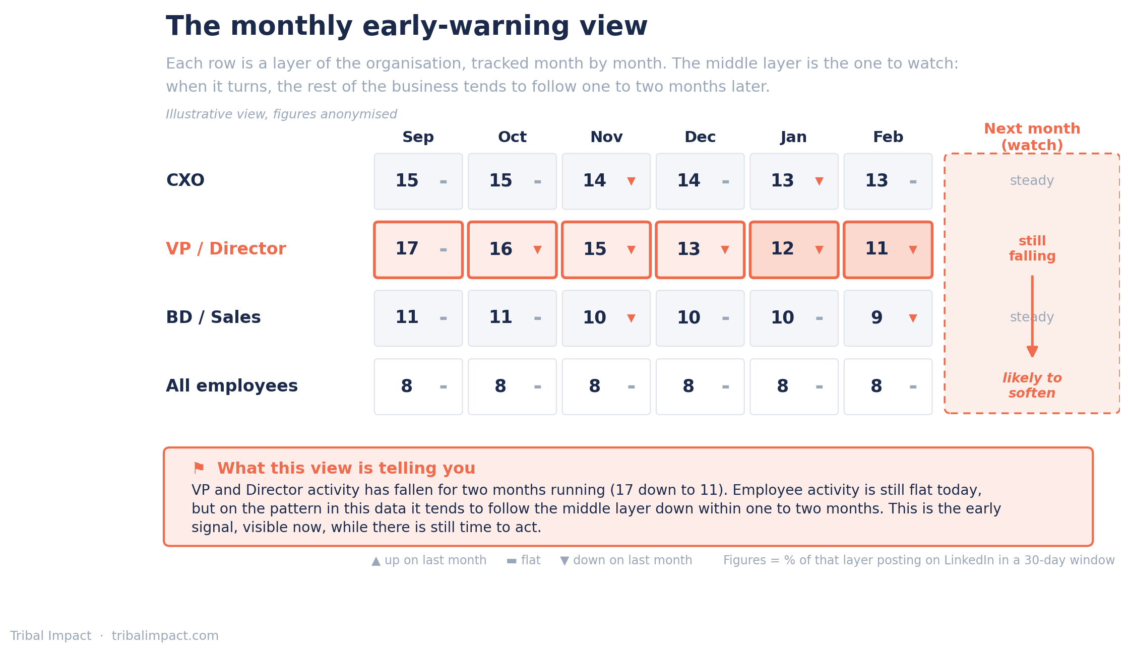
From there, know what good looks like within your organisation, against your sector and/or using our benchmark data - because a dip only means something relative to a wider benchmark.
What counts as noise
Our data shows that a VP or Director going quiet shows up in employee behaviour within a couple of months and recovers on a similar timescale once addressed.
A restructure is different. Right now organisations everywhere are restructuring around AI: roles moving, budgets frozen, relationships breaking as people leave and sometimes take colleagues and vendors with them. When that happens, employees stop posting for a longer and more human reason: they are asking whether they are safe, whether they still have a role, where they fit. That is a cultural impact, and the recovery is measured in multiple months, not two.
The internal message during those periods (and the one I would lead with) is this: your visibility benefits you before it benefits the company. Whatever happens to this organisation, your professional brand travels with you. That framing survives a restructure whereas “please post for us” does not.
One more pattern from the data is worth filing under noise that is not noise: executives getting active in the wrong way. We see leaders pulling content in-house because AI makes posting fast, efficient and cheap, and the result is volume with tell-tale signs, brand-centric mixes with no personality and declining engagement rates to match.
The posts cutting through right now are stories, increasingly told straight to camera via video. Activity that rises while quality falls is not a recovery. It shows up in the engagement data soon enough.
When one layer moves alone
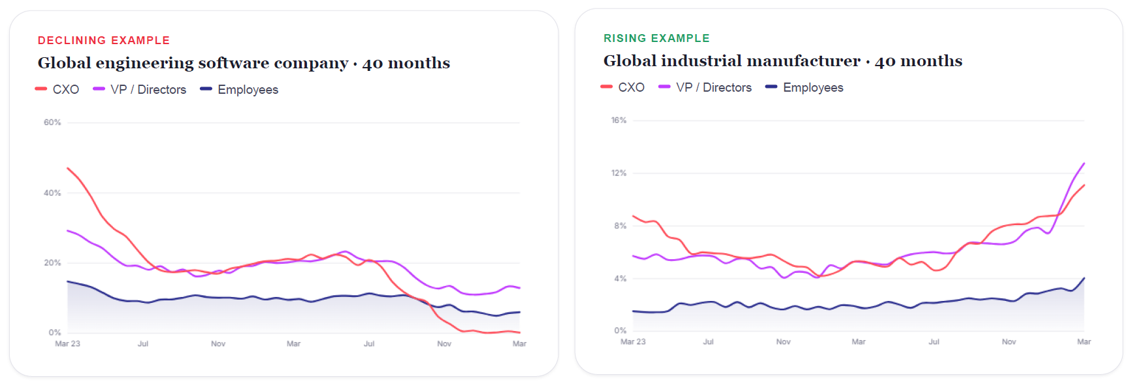
Does employee activity ever fall while leadership holds? Sometimes, yes. One enterprise software company in our dataset shows a VP and Director layer holding strong while every other layers gently decline.
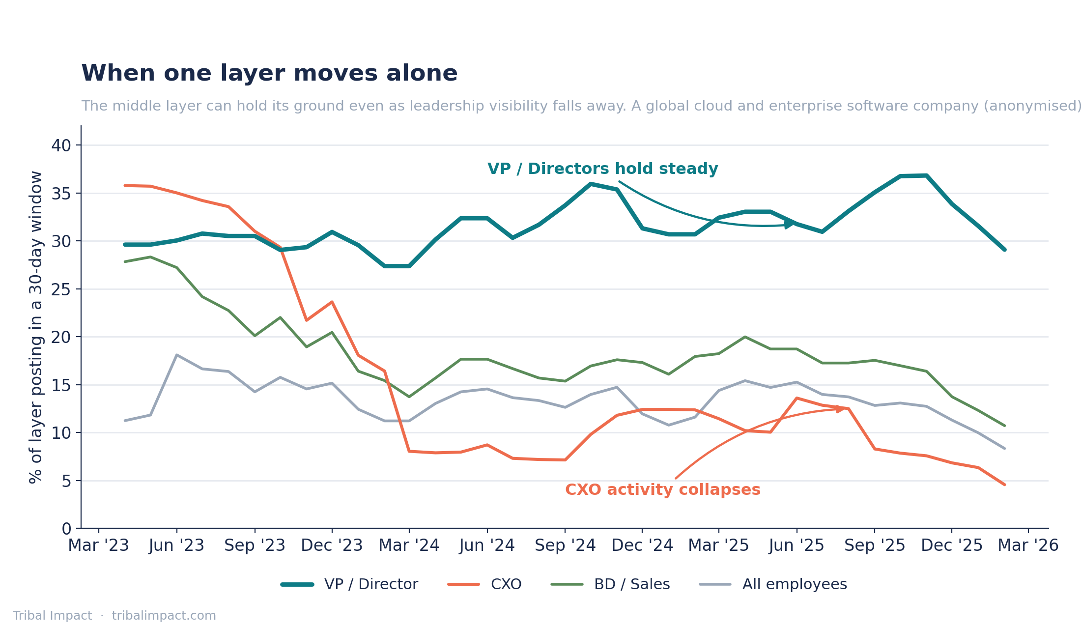
When you see one layer thriving and another declining, you are usually looking at a map of where the investment went.
-
Employee advocacy sits with the social media team.
-
Executive visibility sits with communications.
-
Digital selling sits with sales enablement.
The VP and Director layer, the one our data says matters most, typically sits with nobody. Divergence between layers is very often an indicator of siloed budgets, not of behaviour, and while those investments stay siloed in their functions, the compounding effect between layers never takes flight.
The hard part: acting on a signal that points upward
Everything above is mechanics. The real gap, the reason this article exists, is what a programme lead does when the warning lights show and the cause sits two pay grades above. You may not be able to influence a director directly but what you can do is change the conversation. In my experience the conversation fails for one reason before any other: language.
Programme managers talk to leaders about clicks, engagements, and which post performed. Leaders shut down. People hold leadership positions to drive growth, or occasionally to drive efficiency, and a report about 'engagements' speaks to neither. If you cannot connect the activity to how the business grows, refrain from asking for the meeting.
Change the language. Start with the leaders who are already dabbling, the inconsistent ones, the ones sharing brand content with no personality, because they have the least distance to travel.
Do not arrive with tips on optimising their posts. Arrive with evidence their posts are working at the level they care about - for example:
-
Did you know your top customers engaged with that post?
-
Analysts have been engaging too.
-
There is a comment from a customer here you have not replied to.
Value first, and value in the language of growth: customers, analysts, buyers, not impressions.
Once your active leaders are visibly better, you have earned your stripes to approach the inactive ones, and now you carry the most persuasive evidence that exists inside any leadership team: a peer.
Look at what she is getting from customers. Look at the habit he has built; he is doing videos now. Very little moves an executive like another executive doing it well. Competition between leaders is a renewable resource. Use it.
The programmes are not connected. The behaviours are.
If you run advocacy, you are running one programme inside a system of four or five. The executive comms team, the sales enablement team, and you are pulling on the same behavioural threads whether anyone planned it or not, because our data is unambiguous that the layers move together. What their programmes do lands in your numbers, and what yours does lands in theirs.
The closing advice is not another metric. It is a meeting. Find the people running the other programmes, show them the cascade, agree what each of you watches and who says what when a layer goes quiet. The early-warning signal only works if someone owns the connected view.
The full research, including the sector benchmarks to set your thresholds against, is free to read: https://www.tribalimpact.com/thehumanedgereport. And if you want to know where your organisation’s layers sit against the 860 we tracked, ask. That is a conversation worth having before the signal fires, not after.